Use Pagination to let users navigate through content broken down into pages. Usually paired with tables, but works with other types of page content.
Usage
When to use
- To break down large content into pages. Usually paired with tables, but works with other types of page content.
When not to use
- As a navigation control for a flow or to pair with a stepper, i.e. for a guide, tutorial, or setup flow.
- As a controller to switch between multiple views. Use Tabs instead.
Numbered vs Compact
Cursor and offset are the most common types of pagination. Currently, most HashiCorp products use cursor-based pagination.
Cursor-based pagination allows users to navigate to the next or previous set of records no matter where the user is located within the dataset (record 1 or 300). This type of pagination uses the latest record that has been delivered to the client from a database to determine the relative location within the data set, rather than the exact page number.
Offset or page-based pagination divides a dataset into pages containing a default or user-determined number of records, and allows users navigate to any particular page. In most cases, the numbered pagination provides a better user experience. It allows users to jump between pages and always return to the first page or go to the last page without navigating through the pages manually.


Truncation
By default, in Numbered Pagination, the number of visible pages will be truncated when the total number of pages exceeds seven. What pages are truncated depends on the current page the user is on, with a few notable constants:
- The first and last page will always be displayed (never be truncated).
- The previous page and next page compared to the current page will always be displayed (unless the current page is the first or last page).
- A maximum of seven pages or truncated pages will always be displayed.
Current page examples
These examples showcase where truncation will occur depending on what page the user is on; at the start, middle, or end of Pagination.


When to use truncation
Truncation can help to reduce the cognitive load on the user by only displaying immediately relevant pages to navigate between; those directly surrounding the current page, and the first/last page.
While not intended to be used as a solution for a responsive layout, truncation can help to save space if there are many pages.
When not to use truncation
Truncation can have a negative impact on the user experience if navigating to a specific page is required, or if seeing all of the pages at once benefits the user.
Spacing
- When using the pagination bar, the container should be flush on the left & right with the content.
- When using the pagination, the component should be center aligned with the content it relates to.
- Make sure there’s enough distance and breathing room between the pagination and unrelated content (e.g. another section below it), so it’s clear what content the pagination is paired with.
When pairing the pagination or pagination bar with your content, we recommend leaving 16px of margin between the pagination and the content it relates to.
If your product uses a significantly higher or lower spacing scale, increase or decrease the spacing accordingly.
Pagination and filtering
While pagination can be beneficial for dividing up and displaying a large dataset into more manageable chunks, relying solely on pagination and sorting to find a specific record or set of records results in a poor user experience. This is especially true in cursor-based pagination, where it may not be clear to the user where their relative position is within the dataset.
Instead, more effort should be put into filtering the data set to limit the number of returned results, with pagination used as an enhancement.
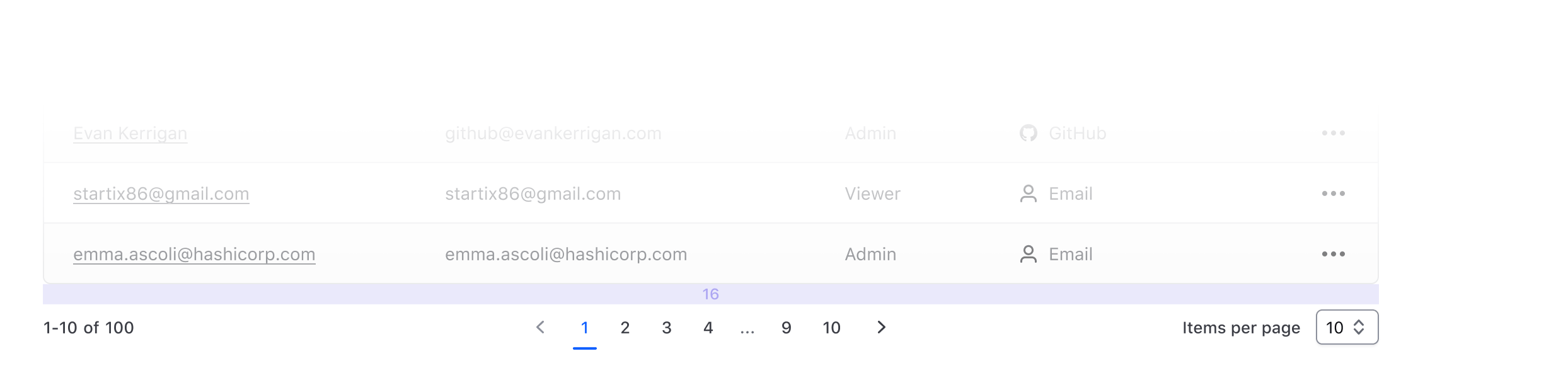
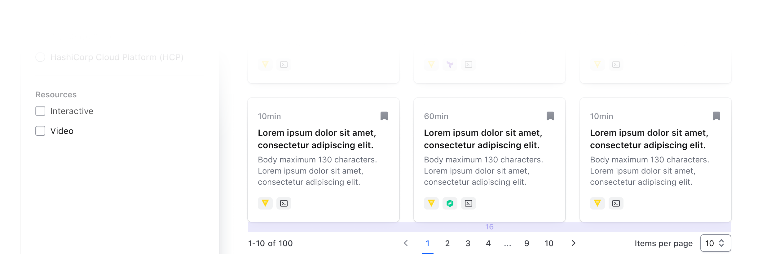
Compact vs Numbered Pagination
There are two different variants of the Pagination component (with different ways to invoke them) built to cover different use cases, contexts, and designs you may need them for.
This differentiation is necessary to cover both use cases of pagination for a list with a known number of elements (i.e., "numbered") and one in which this information is not available or is cursor-based (i.e., "compact").
In the first one, the user is presented with a list of navigation controls ("prev/next" and "page numbers" to go directly to a specific page) and other optional UI elements; in the second, much simpler one, the user is presented with only the "prev/next" controls (by default).
When pagination is invoked directly using one of these two components, it will automatically:
- provide the correct responsive layout for the entire Pagination and its sub-parts.
- manage the "current page" status across the different sub-components it’s made of (based on the arguments provided to it and its children).
- when one of the "navigation controls" is clicked, a callback function (if provided) is called, and a route (if provided) update is triggered.
- when the "page size" is changed via the provided selector, in the "numbered" variant it will automatically recalculate the total number of pages to display to the user.
Pagination sub-components
If you need more control on the specific Pagination parts, and/or you need to cover a very specific use case, you can use the Pagination sub-elements directly (Pagination::Info/Nav(*)/SizeSelector).
In this case, you will have to take care of different things yourself
- the organization/layout of the elements on the page.
- the logic to handle the "current page" status.
- the logic connecting the different parts (if using Numbered Pagination).
Events handling and routing
As described above, the main Pagination::Numbered and Pagination::Compact components expose an onPageChange callback function, invoked whenever a page change occurs. All the "navigation controls" in this cases are <button> elements that fire an onClick event that calls the onPageChange function.
This means that if you need to update the URL when the user changes the "page" in the Pagination (eg. to add/remove/update some query parameters), you have to do it within the onPageChange callback you provide to the component.
If instead you need to update the URL directly when the user clicks on one of the "navigation control" elements, you have to provide routing parameters (route/query/model/etc) to the component; refer to the "Component API" section below for specifications about these parameters (the APIs are slightly different for the two components).
How to use Numbered Pagination
The basic invocation of Numbered Pagination requires the @totalItems argument to be provided (plus the event/routing handlers, see below):