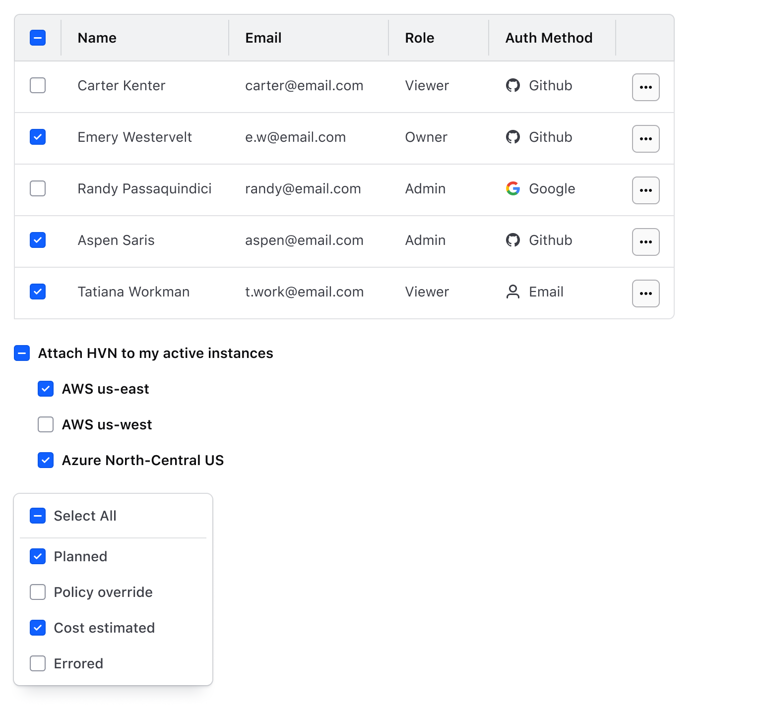
A form element that allows users to select one or more items from a group of items.
An input of type "checkbox" is a form element that allows users to select one or more items from a list of individual items.
Usage
When to use
To allow users to check or uncheck an option or setting.
To allow users to select one or more options from a list.
When not to use
When only one choice can be selected, consider Radio buttons.
When checking or unchecking results in an immediate change, consider Toggle.
Layout
We recommend using vertical Checkbox groups, especially with short option lists.
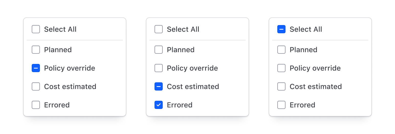
Indeterminate state
Indeterminate states indicate a "partially checked" condition in nested structures or tables.
Do
Don’t
Required and optional
For complex forms, indicate required fields. This is the most explicit and transparent method and ensures users don’t have to make assumptions. Read more about best practices for marking required fields in forms.
For shorter, simpler forms (e.g., login/signup and feedback requests), indicate optional fields instead.
The page navigation is complete. You may now navigate the page content as you wish.
A form element that allows users to select one or more items from a group of items.
An input of type "checkbox" is a form element that allows users to select one or more items from a list of individual items.
Usage
When to use
To allow users to check or uncheck an option or setting.
To allow users to select one or more options from a list.
When not to use
When only one choice can be selected, consider Radio buttons.
When checking or unchecking results in an immediate change, consider Toggle.
Layout
We recommend using vertical Checkbox groups, especially with short option lists.
Indeterminate state
Indeterminate states indicate a "partially checked" condition in nested structures or tables.
Do
Don’t
Required and optional
For complex forms, indicate required fields. This is the most explicit and transparent method and ensures users don’t have to make assumptions. Read more about best practices for marking required fields in forms.
For shorter, simpler forms (e.g., login/signup and feedback requests), indicate optional fields instead.